A gallery wall can look like a designer did it… or like you panic-hung random frames at midnight. The difference usually isn’t money—it’s layout planning, consistent spacing, and choosing the right frame sizes.
This guide walks you through a “no-regret” method that works in real homes (rentals included), plus the spacing trick that makes everything look intentional.
Why Most Gallery Walls Look Cheap (And How to Avoid It)
Most gallery walls fail for three reasons:
- Inconsistent spacing (some frames touch, others have big gaps)
- Wrong scale (too small for the wall, floating above furniture)
- No visual rhythm (all frames the same size, or all different with no pattern)
You don’t need expensive art. You need structure.
Step 1: Pick the Right Wall and Choose Your “Anchor”
Start with a wall that makes sense:
- Above a sofa
- Above a console table
- Along a staircase
- Over a bed
- In a hallway with enough breathing room
The anchor rule (the one designers always follow)
Your gallery wall needs one “anchor” that sets scale:
- One larger piece (or a larger frame)
- Or a centered “hero” piece you build around
Why it works: Without an anchor, the wall looks like a bunch of small objects scattered.
Step 2: Choose a Layout Style (So It Doesn’t Look Random)
Pick one of these layouts depending on your vibe:
A) Grid (clean and expensive-looking)
- Same-size frames in rows/columns
- Best for modern, minimalist homes
- Lowest risk of looking messy
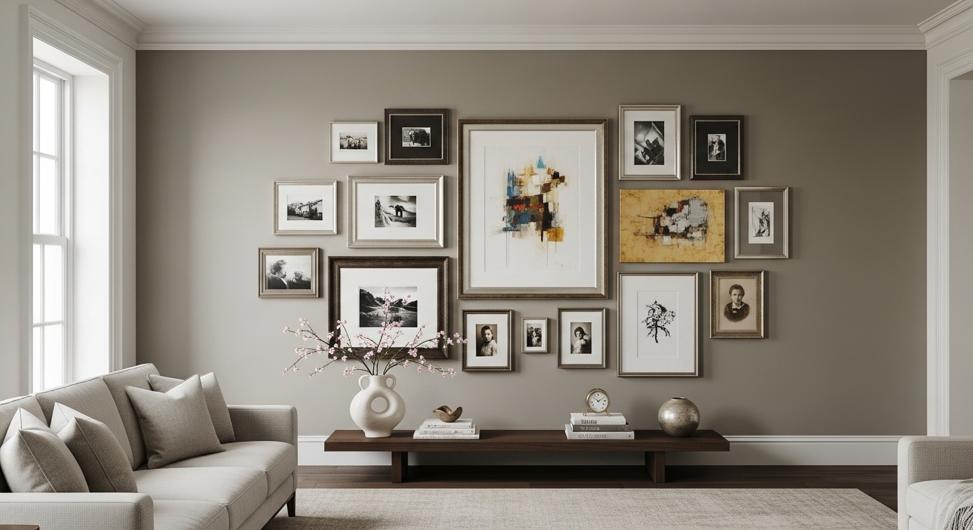
B) Salon-style / organic (cozy and curated)
- Mixed sizes arranged intentionally
- Best for eclectic, vintage, warm spaces
- Looks expensive if spacing is consistent
C) Row or ledge-style (easy + renter-friendly)
- A long horizontal line (great above sofas)
- Or a picture ledge where you lean frames (easy to swap)
No-regret tip: If you’re nervous, start with grid or row. Organic layouts take more planning.
Step 3: The Spacing Trick That Makes It Look High-End
Here’s the simplest rule that instantly improves the look:
✅ Keep spacing consistent: 2 inches between frames (about 5 cm)
- Use 2″ for most walls, especially above furniture
- If frames are very small or you want a tighter look, you can go slightly less
- If frames are huge, you can go slightly more—but keep it consistent
Why this works: Consistent spacing creates visual calm. Your brain reads it as “planned,” which reads as “expensive.”
Easy way to keep spacing perfect
- Cut a piece of cardboard to your spacing size (2″)
- Use it as a spacer between frames while marking positions
Step 4: Choose Frame Sizes That Look Balanced (Not Tiny)
This is where most people accidentally make it look cheap: they go too small.
A good starting mix (for an organic wall)
- 1–2 medium/large frames (your anchors)
- 2–4 medium frames
- 2–6 smaller frames (fillers)
Scale rule above furniture
If the gallery wall sits above a sofa/console:
- Your gallery wall should be roughly 2/3 the width of the furniture below it
- Start the bottom edge about 6–10 inches above the furniture (so it feels connected)
If it’s too high or too narrow, it looks like it’s floating.
Step 5: Plan the Layout on the Floor (Before You Touch the Wall)
This is the “no-regret” step.
- Clear floor space
- Lay out frames in your chosen style
- Adjust until it feels balanced
- Take a photo from above
Quick balancing checks
- Do you have at least one anchor?
- Is there a mix of sizes (if organic)?
- Are heavy/dark pieces distributed (not all on one side)?
- Does it look centered over the furniture?
If something feels “off,” it’s usually because one side is visually heavier.
Step 6: Transfer the Layout to the Wall (Without Guessing)
You have two easy options:
Option A: Paper templates (most accurate)
- Trace each frame on paper (or use kraft paper)
- Tape the paper shapes to the wall
- Adjust until perfect
- Mark hanging points through the paper
Option B: Painter’s tape outline (fast + clean)
- Outline the full gallery-wall boundary with tape
- Mark the center line
- Place frames within the taped boundary
Pro move: Measure from the floor or furniture to keep everything level and consistent.
Step 7: The “Expensive” Finishing Rules
These small details create the designer look:
Keep frame finishes consistent (but not necessarily identical)
Choose one:
- All black frames
- All wood tones
- All white frames
- Or a mix of black + wood only (two finishes max)
Too many finishes looks chaotic.
Use consistent matting (if you use mats)
White/cream mats make almost any print look higher-end.
Don’t overload the wall
Negative space is what makes a gallery wall feel curated, not cluttered.
Align something
Even in an organic layout, align at least one thing:
- top edges of a row
- a center line
- the bottom edges of a few frames
This “hidden order” is what makes it feel expensive.
What to Put in Your Frames (Without Buying Art)
You don’t need expensive prints. You need cohesion:
- Family photos in the same tone (all black-and-white or all warm color grading)
- Simple typography prints (same font family)
- Nature photos with similar color palette
- Abstract shapes in matching tones
- A few personal pieces (tickets, postcards, sketches) framed cleanly
The easiest cohesive theme:
Black-and-white + one accent color somewhere in the wall (like a single muted blue or olive print).
Common Mistakes (And Quick Fixes)
Mistake: Frames are too high
Fix: Bring the wall down so it connects to furniture (6–10 inches above is a safe zone).
Mistake: Spacing is uneven
Fix: Re-hang with a cardboard spacer. Consistent spacing is everything.
Mistake: Too many tiny frames
Fix: Add one larger anchor frame or group small frames tightly into a grid block.
Mistake: It looks “busy”
Fix: Reduce variety: fewer frame finishes, fewer colors, more breathing room.
My Honest “Do This First” Recipe (Works Every Time)
If you want a safe, expensive look:
- Pick one wall + one anchor frame
- Decide: grid or organic
- Lay everything out on the floor
- Use 2-inch spacing consistently
- Keep frame finishes to one or two
- Hang within a boundary that’s about 2/3 the width of the furniture below
That’s it. This method creates the designer look even with budget frames and simple prints.
FAQ (SEO-Friendly)
How far apart should frames be on a gallery wall?
A consistent 2 inches between frames is the easiest rule for a polished look.
Should a gallery wall be centered on the wall or the furniture?
If it’s above furniture, center it on the furniture, not the wall.
What’s the easiest gallery wall layout for beginners?
A grid or straight row layout is the most beginner-friendly and the hardest to mess up.